Open up a site that went live three years ago and then one that launched last month. The older one tends to feel a bit stiff, even if nothing is actually wrong with it. That’s what design trends are all about, really.
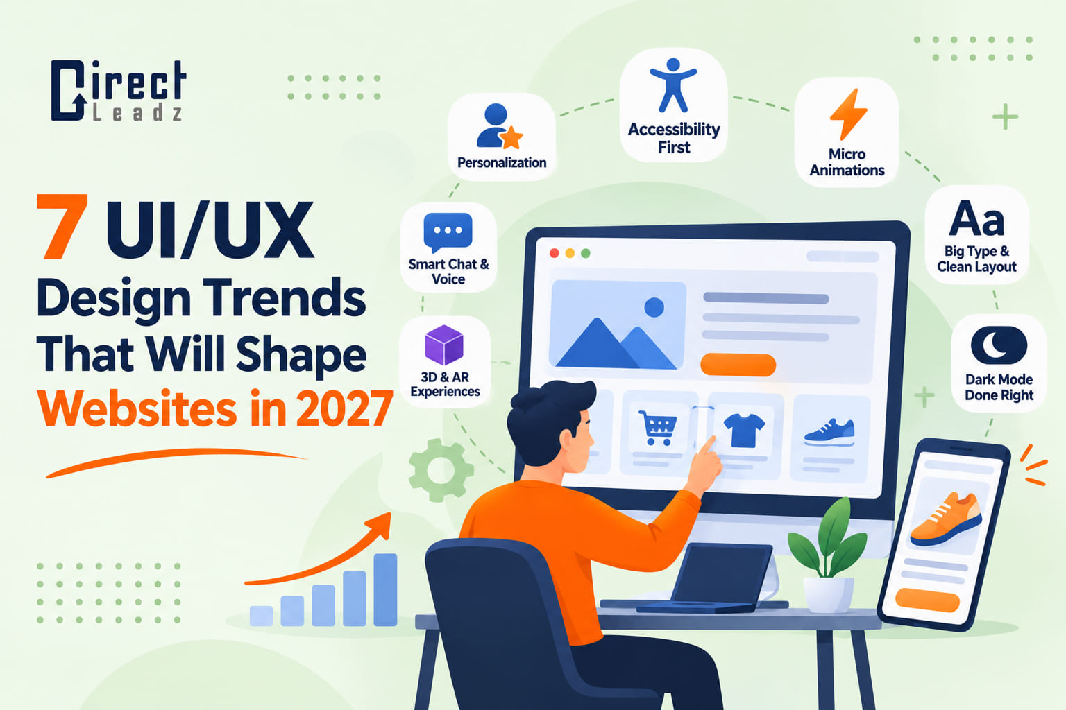
Here are seven UI/UX design trends we expect to be important in 2027. Some of them are already starting to show up on sites we visit every day. For each one, we’ve included a note on when it’s beneficial and when it’s probably best to avoid it altogether.
1. Personalization that stays out of the way
Sites are getting much better at adapting to who’s looking at them. A returning visitor who’s been browsing a category will land on that category. A first-time visitor gets a brief intro instead.
Done well, you don’t notice at all. Done badly, it’s like you’re being shadowed around a shop. Start with a small thing, a ‘pick up where you left off’ block, and state very clearly what data you’re using.
2. Chat and voice that actually answer questions
Most website chatbots are a pain. They loop, they misread your question, and they’ll hide the contact form. The newer generation of assistants are much better at understanding a full sentence and directing you to the right page.
That’s useful at 11 pm when no one’s on your team. Just have a clear way to get to a human. People are far more likely to forgive a bot that admits it’s stuck than one that’s just going to pretend it isn’t.
3. Accessibility built in from day one
Accessibility used to be a box that you’d just tick at the end of a project. That’s now changing, in no small part due to the rules getting tighter. The EAA (European Accessibility Act) came into force in June 2025, and there are a lot of businesses outside of Europe that sell into it.
The fixes are rarely glamorous:
- Text with enough contrast against its background
- Buttons you can reach with the Tab key
- Alt text that describes the image, not the file name
- Forms with proper labels
Try that quick test. Put your mouse down and do the enquiry entirely with the keyboard. If you get stuck, you’ll find that many real visitors do too. WCAG 2.2 is a good benchmark.
4. Small animations with a job to do
A button that gives a slight ‘click’ when pressed. A progress bar that moves during the checkout process. These are the little things that say “yes, that worked,” and that quiet bit of reassurance goes a long way to reducing the number of double clicks and forms that get abandoned.
The trap is decoration. If you’re making someone wait, then you’re costing yourself more than you’re gaining. Keep it short. Respect the ‘reduce motion’ setting on phones and laptops.
5. Big type, plenty of space
Large headlines and generous spacing are still the way to go, largely because so much of the traffic now reads on a phone. Block style (each section in its own neat card) is very easy to thumb through.
There’s an added benefit there too in that you’re forced to work out what’s important on the page with such limited space. Two typefaces are more than enough.
6. Dark mode that’s been properly tested
So many people just leave their devices in dark mode all day. A site that does that is a very considerate site, particularly if you’re browsing in the evening.
But simply flipping every colour isn’t the answer. Logos with white boxes look terrible on black, and some of the greys become completely unreadable. You need to check the text, images, charts and form fields in both modes prior to launch.
7. 3D and AR, only when the page stays fast
Spinning a sofa around on screen or just previewing a lamp on your own desk via the phone camera can actually go a long way to getting someone to buy. It answers the ‘will this fit?’ question far better than any paragraph ever could.
Here’s the catch. Heavy 3D files are going to kill page speed, and pages that don’t load quickly lose visitors rapidly. Only load the viewers when someone actually asks for them and ensure the page still works without them.
Which of these are you actually meant to use?
Probably two, maybe three. You’ll generally end up with a rather cluttered site if you try all seven at once, one that’s going to be considerably harder to use than the old one.
A sensible order of work:
- Check your analytics and your session recordings to see where the visitors are having problems.
- Pick the trend that deals with that particular problem.
- Test it with a small number of real users prior to rolling it out.
- A few weeks later, compare bounce rate, form submissions and sales.
That’s why good UI UX design services begin with research rather than a mood board. The UI UX design trends that are currently in vogue only make sense if they’re actually serving what your audience is trying to achieve.
If your site is already a bit outdated, then our post on the 7 signs your business needs a professional website redesign will help you work out whether you need a minor tweak or a full rebuild.
Picking a design partner
Looking for the best UI/UX design company? Put the beautifully polished portfolio to one side for a moment and ask how they actually work.
- Do they study your customers and your data prior to drawing anything?
- Can they point to actual results (e.g., more enquiries) rather than just hand out screenshots?
- Do the designers and developers work together, or is it a case of one just handing off to the other?
- How do they deal with accessibility and page speed?
At Direct Leadz, designers are right alongside the developers from the very first sketch, ensuring that ideas are buildable. Our UI/UX design and web design pages are a good example of how we work.
Final Thoughts
Trends come and go. What endures is the simple principle of making it easy for visitors to do what they came to do. UI/UX design trends are just tools to achieve that end, not the end in themselves.
Any thoughts on a refresh? Pop over to the Direct Leadz team and let them know what you’d like to see improved.